How To Use the Utility Dashboard Plugin.
Purpose:
This post will explain how to use the Utility Dashboard plugin. The Utility Dashboard is primarily used by commercial clients. Stacy, Nick wants this one left as a draft for now.
Instructions:
- Click on the icon in the lower left of the My.Eyedro.com page
- Select Utility Dashboard
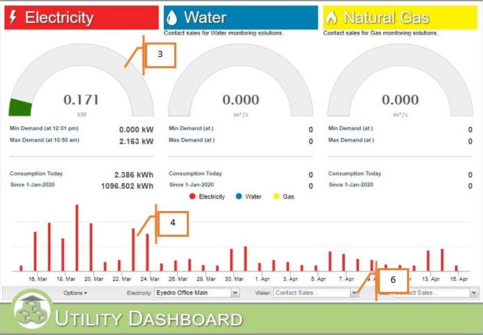
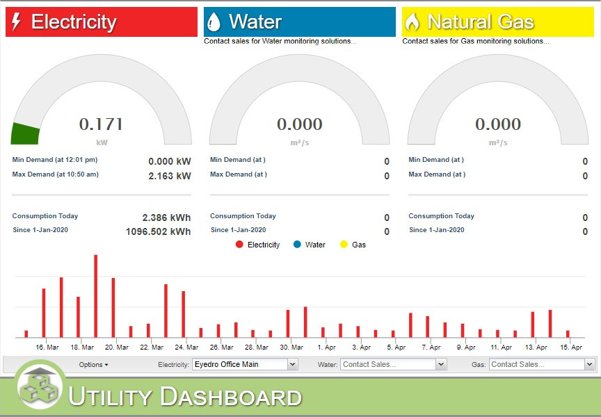
- You will see three dials, one for electrical consumption, one for water consumption, and one for gas consumption.
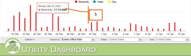
- Across the bottom there is a bar graph showing monthly consumption for each category, red for electricity, blue for water, and yellow for gas.
- You can hover your mouse over the graph for more detailed information.
- You set the display groups to be monitored in the dropdown boxes for each category.
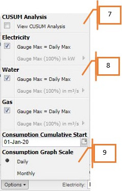
- In the options you can set the CUSUM analysis (if you have it available) on or off.
- In the options you can set the various gauge maximums to automatic or a specific value.
- You can set the graph to display daily consumption or monthly.