
Asset Dashboard | MyEyedro User Guide
The MyEyedro Asset Dashboard plugin displays run-state analysis for one or more configured assets, in various user configurable, presentation formats. The Asset Dashboard provides:
- Personalized Control Hub: Monitor your equipment’s performance using a User-Configured Asset Dashboard that converts raw operational data into impactful visual formats suited to your workflow.
- Consolidated Asset Insights: Gain an overview of your entire production floor with a Centralized Summary Panel that gathers essential performance indicators from all tracked assets into one comprehensive view.
- Dynamic Operational Mapping: Effortlessly switch between an overview Asset List and in-depth State Graphs to quickly pinpoint which machines are running, inactive, or need servicing.
It is assumed that each “asset” is being independently monitored either by installing Eyedro Electricity Monitors on their isolated branch circuit(s) or using Eyedro Machine Monitoring products inline with the individual pieces of equipment. See Assets Configuration for additional information on assets and asset profiles.
The Asset Dashboard plugin is only available to users with a MyEyedro Professional license. To add a MyEyedro Professional license to your account and assign it to a device, please read the article here.
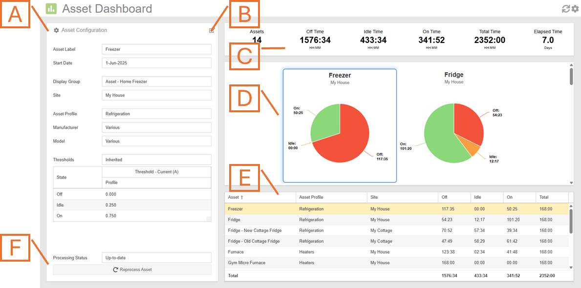
- Asset Details. Displays the currently selected asset’s configuration and profile details. The displayed data can be changed by selecting the desired asset from the asset list (E).
- Asset Edit button. Clicking on this button will redirect you to the Asset Configuration plugin for editing of either the asset or the asset profile associated with it.
- Summary Panel. Displays summary information for all of the assets selected for presentation.
- Asset Graph Region. Displays the state information for the selected assets in various forms based on selected options.
- Asset List. Displays a list of assets selected for display and their run-state details.
- Reprocess Asset button. Press this button to force the reprocessing of the asset.
Asset Dashboard Plugin Tools and Options
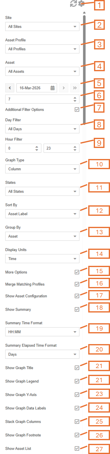
- Plugin Tools:
- Refresh. Update the data and visuals on screen.
- Options. Expand or collapse the options menu.
- Select which Site‘s assets to display or choose “All Sites”. NOTE: this option will only appear if there are assets associated with more than one site.
- Select which Asset Profile to display or choose “All Profiles”. NOTE: this option will only appear if there is more than one asset profile created by, or shared with, your user account.
- Select which Asset to evaluate or choose “All Assets”. NOTE: this option will only appear if there is more than one Asset defined.
- Choose the End Date for which asset data is displayed. By default this will be set to the previous date (yesterday).
- Choose the number of days for which Asset data is displayed (up to and including the chosen end date).
- Check the Additional Filter Options checkbox to show day and hour filtering options.
- Optionally, check the Filter Inactive Assets option to remove any assets that has start or end dates resulting in it being completely outside of the selected period of analysis. NOTE: this option will only appear if the Additional Filter Options checkbox is checked.
- Optionally, choose the day(s) of the week to display. NOTE: this option will only appear if the Additional Filter Options checkbox is checked.
- Optionally, choose the hours of the day(s) to display. NOTE: this option will only appear if the Additional Filter Options checkbox is checked.
- The Graph Type will change what style graph is used to present the data.
- Check the Aggregate Heat Map option to plot a single heat map graph that includes all assets. NOTE: this option will only appear if Graph Type is set to Heat Map.
- Select which States to include in the data presentation. NOTE: this option is not available if Graph Type is set to Pie or State Map.
- All States (not available in Heat Map)
- On State
- Idle State
- Off State
- Select the preferred data Sort By method. This will sort the results in the graph region and asset list accordingly.
- Use the Group By options to select how to group the assets and their state data for presentation. NOTE: this option will only appear if Graph Type is set to Column.
- Asset
- Asset and Day
- Day
- Hour
- Choose the Display Units for data presentation.
- Time
- Percent
- Assets (only column graphs grouped by day or hour)
- Check the More Options checkbox to show additional options.
- Use the Merge Matching Profiles option, to merge multiple asset profiles with very similar labels. Often when assets are shared with you, from other user accounts, they may have the same labels for asset profiles as you do. Use this option to merge profiles with matching names.
- Show/hide the Asset Configuration Panel (A).
- Show/hide the Summary Panel (C).
- Choose the format to use for the Summary Time items in the Summary Panel. NOTE: this option will only appear if the Summary Panel is shown and the Display Units is set to Time.
- Choose the format to use for the Elapsed Time in the Summary Panel. NOTE: this option will only appear if the Summary Panel is shown.
- Reverse State Colors (not shown) option is used to switch the green and red colors used to identify on and off states (idle color is not affected). By default, the On state is identified by green and the Off state is identified by red.
- Show/hide the graph title.
- Show/hide the graph legend. NOTE: this option is not available if Graph Type is set to Pie.
- Show/hide the graph y-axis. NOTE: this option is not available if Graph Type is set to Pie.
- Show/hide the day of week string in the x-axis labels. NOTE: this option is not available if Graph Type is set to Pie.
- Show/hide the graph’s data labels.
- Stack/unstack the Graph Columns. NOTE: this option will only appear if Graph Type is set to Column.
- Show/hide the Graph Footnote. NOTE: this option will only appear if Graph Type is set to Column.
- Show/Hide the Asset List (E).
Assets State Pie Chart
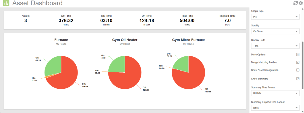
- Select the desired asset(s) and period by appropriately setting the Site, Asset Profile, and Asset filters as well as choosing the End Date and Number of Days options.
- Set Graph Type option to Pie to view the results of the run-state analysis in a pie chart presentation format.
- Choose the desired Display Units. For pie charts, you can choose between Time or Percent.
- Optionally, adjust other presentation filtering, sorting and and display preferences (all options described above).
Assets State by Asset Column Chart
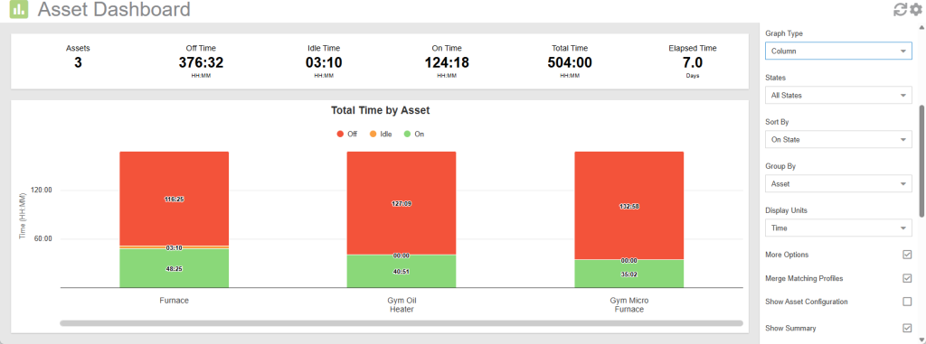
- Select the desired asset(s) and period by appropriately setting the Site, Asset Profile, and Asset filters as well as choosing the End Date and Number of Days options.
- Set the Graph Type option to Column to view the results of the run-state analysis in a column chart presentation format.
- Set the Group By option to Asset to enable this display format.
- Optionally, adjust other presentation filtering, sorting and and display preferences (all options described above).
Assets State by Asset and Day Column Chart
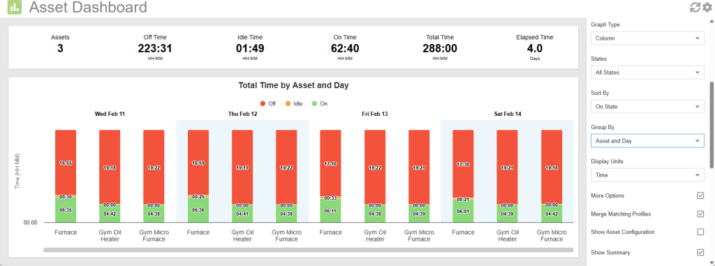
- Select the desired asset(s) and period by appropriately setting the Site, Asset Profile, and Asset filters as well as choosing the End Date and Number of Days options.
- Set Graph Type option to Column to view the results of the run-state analysis in a column chart presentation format.
- Set the Group By option to Asset and Day to enable this display format.
- Optionally, adjust other presentation filtering, sorting and and display preferences (all options described above).
Assets State by Day Column Chart
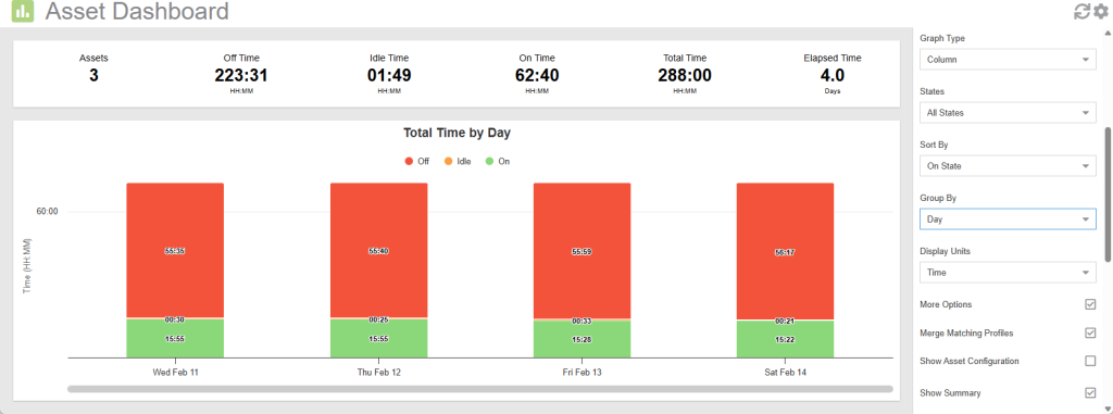
- Select the desired asset(s) and period by appropriately setting the Site, Asset Profile, and Asset filters as well as choosing the End Date and Number of Days options.
- Set Graph Type option to Column to view the results of the run-state analysis in a column chart presentation format.
- Set the Group By option to Day to enable this display format.
- Optionally, adjust other presentation filtering, sorting and and display preferences (all options described above).
NOTE: When viewing with Display Units set to Assets, you will see decimals. This is because, each asset may be in several different states (on, off and idle) for any given day.
Assets State by Hour Column Chart
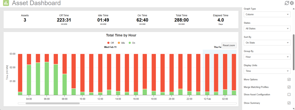
- Select the desired asset(s) and period by appropriately setting the Site, Asset Profile, and Asset filters as well as choosing the End Date and Number of Days options.
- Set Graph Type option to Column to view the results of the run-state analysis in a column chart presentation format.
- Set the Group By option to Hour to enable this display format.
- Optionally, adjust other presentation filtering, sorting and and display preferences (all options described above).
NOTE: When viewing with Display Units set to Assets, you will see decimals. This is because, each asset may be in several different states (on, off and idle) for any given hour.
Asset State Heat Map Chart
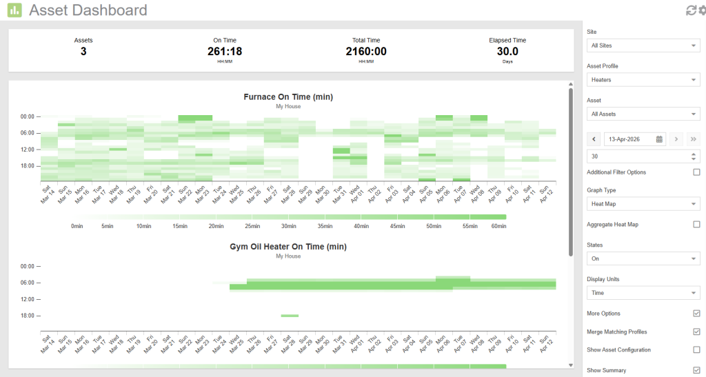
- Select the desired asset(s) and period by appropriately setting the Site, Asset Profile, and Asset filters as well as choosing the End Date and Number of Days options.
- Set Graph Type option to Heat Map to view the results of the run-state analysis in a heat map chart presentation format.
- Optionally, adjust other presentation filtering, sorting and and display preferences (all options described above).
NOTE: The color intensity for each cell (hour) will be directly proportional to the amount of time the asset was in the selected state during the period. Bolder colors indicate more time in that state for the given hour.
Asset State Map
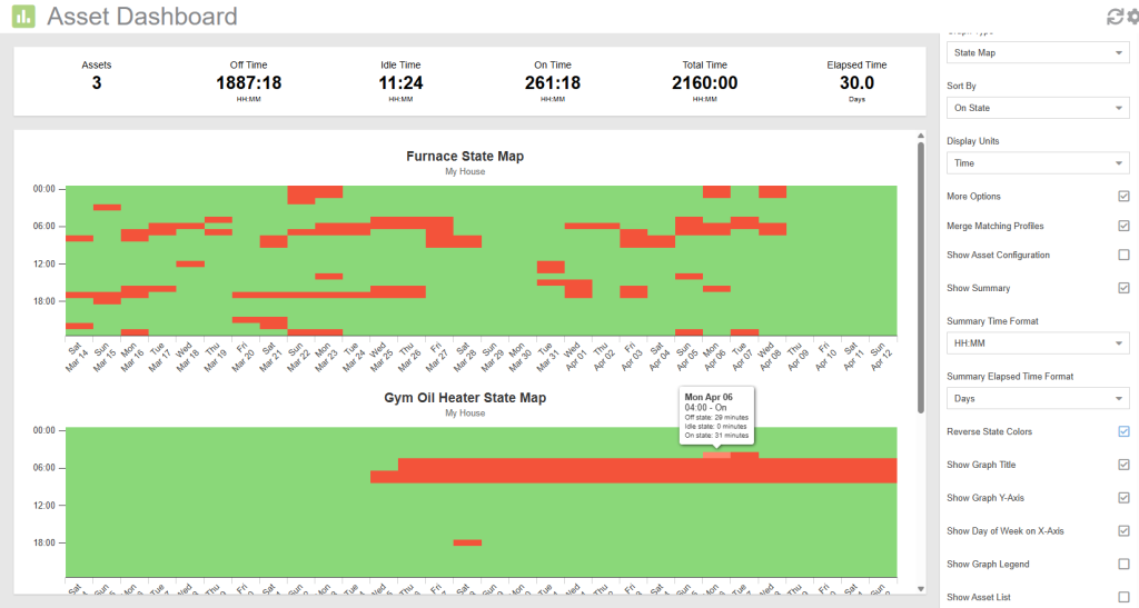
- Select the desired asset(s) and period by appropriately setting the Site, Asset Profile, and Asset filters as well as choosing the End Date and Number of Days options.
- Set Graph Type option to State Map to view the results of the run-state analysis in a state map chart presentation format.
- Optionally, adjust other presentation filtering, sorting and and display preferences (all options described above).
NOTE: Each asset may be in several different states (on, off and idle) for any given hour. The color for each hour will be based on the dominant state for that hour. By hovering over the cells in the chart, you are able to see the detailed breakdown for each state.